Color Psychology in Workspace Design: How Colors Affect Your Productivity
Learn how colors influence mood, focus, and productivity. Apply color psychology principles to your browser, desktop, and digital workspace for better results.
The colors surrounding you affect how you think, feel, and work — whether you realize it or not. This guide explores color psychology and shows you how to apply it to your digital workspace for improved focus, creativity, and wellbeing.
The Science of Color Psychology
How Colors Affect the Brain
Colors influence us through two mechanisms:
Biological responses:
- Blue light affects alertness and sleep cycles
- Warm colors increase heart rate slightly
- Cool colors promote relaxation
- Brightness affects energy levels
Psychological associations:
- Cultural meanings (white = purity in West, mourning in East)
- Personal experiences (favorite colors, memories)
- Learned associations (red = stop, green = go)
- Context-dependent interpretations
Research Findings
Studies consistently show color effects on cognition:
| Finding | Source | Implication |
|---|---|---|
| Blue enhances creative thinking | University of British Columbia | Use for brainstorming |
| Red improves detail-oriented tasks | Same study | Use for editing, analysis |
| Green reduces eye strain | Multiple studies | Good for extended work |
| Nature colors restore attention | Attention Restoration Theory | Choose nature wallpapers |
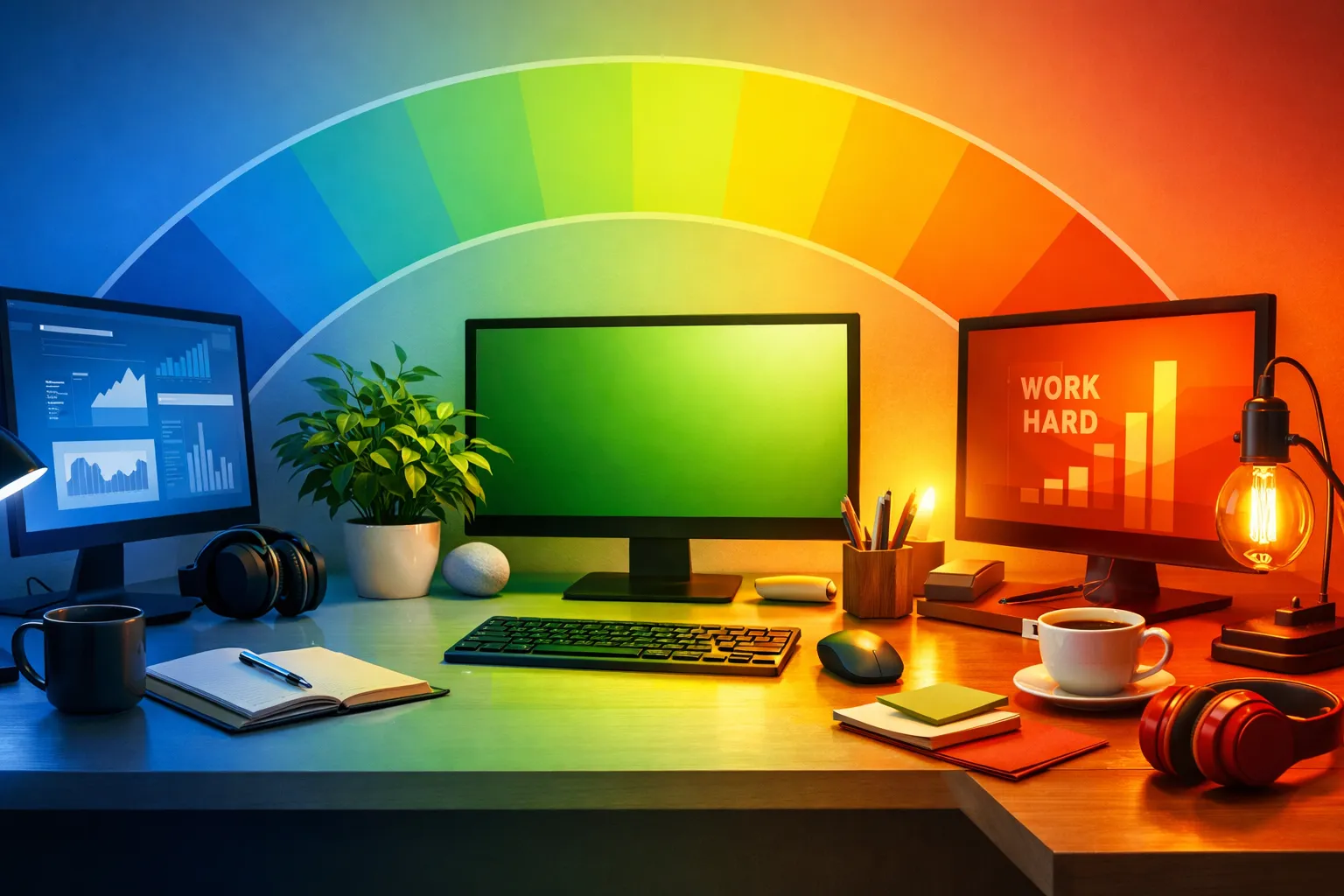
Colors and Their Effects
Blue: The Productivity Color
Psychological effects:
- Promotes calm and focus
- Reduces stress and anxiety
- Encourages clear thinking
- Lowers heart rate
Best for:
- Analytical work
- Writing and reading
- Long focus sessions
- Professional settings
Blue variations:
| Shade | Effect | Use Case |
|---|---|---|
| Light blue | Peaceful, open | All-day backgrounds |
| Sky blue | Fresh, energizing | Morning work |
| Deep blue | Serious, focused | Professional tasks |
| Teal | Creative, unique | Design work |
In your browser: Ocean wallpapers, sky imagery, blue-toned architecture.
Green: The Balancing Color
Psychological effects:
- Most restful for eyes
- Promotes balance and harmony
- Connects to nature
- Reduces anxiety
Best for:
- Extended screen time
- Restorative breaks
- Creative thinking
- Stress reduction
Green variations:
| Shade | Effect | Use Case |
|---|---|---|
| Forest green | Grounding, stable | Deep work |
| Mint | Fresh, light | Creative tasks |
| Sage | Calm, sophisticated | Professional settings |
| Lime | Energizing, modern | Short bursts |
In your browser: Forest imagery, botanical photos, green landscapes.
→ Find green wallpapers: Best Wallpaper Sources
White and Light Colors
Psychological effects:
- Creates sense of space
- Promotes clarity
- Can feel sterile if overused
- Maximum brightness for alertness
Best for:
- Minimalist preferences
- Clean, focused work
- Maximum readability
- Morning productivity
Considerations:
- Can cause eye strain in dark environments
- May feel cold or impersonal
- Best balanced with some color
- Adjust based on ambient light
In your browser: Minimal wallpapers, light gradients, white space designs.
Dark Colors and Black
Psychological effects:
- Reduces eye strain in low light
- Creates focus through contrast
- Can feel sophisticated or oppressive
- Promotes evening wind-down
Best for:
- Night work
- Code and development
- Reduced eye strain
- Evening browsing
Dark mode benefits:
| Benefit | Explanation |
|---|---|
| Less eye strain | Lower brightness in dark environments |
| Better sleep | Reduced blue light exposure |
| Battery saving | On OLED screens |
| Focus enhancement | Fewer visual distractions |
In your browser: Dark themes, night photography, space imagery.
Warm Colors (Orange, Yellow, Red)
Psychological effects:
- Energizing and stimulating
- Can increase anxiety if overused
- Promotes creativity and enthusiasm
- Draws attention
Best for:
- Creative work (in moderation)
- Morning energy boost
- Short, intense sessions
- Accent colors only
Warm color guide:
| Color | Effect | Use Carefully |
|---|---|---|
| Yellow | Optimism, energy | Can be overwhelming |
| Orange | Enthusiasm, creativity | Too stimulating for long work |
| Red | Urgency, attention | Increases stress |
| Pink | Calm energy, compassion | Situational |
In your browser: Sunset wallpapers (occasional), autumn foliage, warm accent elements.
→ Explore: Seasonal Wallpaper Rotation Ideas
Applying Color Psychology to Your Browser
Choosing Wallpaper Colors
Match colors to your work type:
| Work Type | Recommended Colors | Example Wallpapers |
|---|---|---|
| Deep focus | Blues, greens | Ocean, forest |
| Creative work | Varied, some warm | Abstract, artistic |
| Relaxation | Soft greens, neutrals | Nature, soft landscapes |
| Morning startup | Brighter, varied | Sunrise, fresh scenes |
| Evening wind-down | Dark, warm | Sunset, night scenes |
Color Rotation Strategies
Time-based rotation:
| Time | Color Palette | Reasoning |
|---|---|---|
| Morning (6-10am) | Bright, energizing | Wake up, start day |
| Midday (10am-2pm) | Blue, focused | Peak productivity |
| Afternoon (2-6pm) | Green, balanced | Sustained energy |
| Evening (6pm+) | Warm, then dark | Wind down |
Task-based rotation:
| Task | Color Choice | Effect |
|---|---|---|
| Writing | Soft blue/green | Calm focus |
| Brainstorming | Varied, some warm | Stimulate ideas |
| Editing | Neutral, clean | Detail attention |
| Research | Blue, white | Clear thinking |
| Breaks | Nature greens | Restoration |
Building Your Color-Conscious Workspace
Step 1: Assess Your Needs
Consider:
- Primary work type (analytical vs. creative)
- Screen time duration
- Ambient lighting conditions
- Personal color preferences
- Time of day patterns
Step 2: Choose a Base Palette
For analytical/focus work:
- Primary: Blues and blue-greens
- Secondary: Soft neutrals
- Accent: Green for restoration
For creative work:
- Primary: Varied nature colors
- Secondary: Some warm accents
- Accent: Bold colors occasionally
For balanced/general:
- Primary: Nature photography (varied)
- Secondary: Rotate by mood
- Accent: Seasonal changes
Step 3: Configure Your Browser
Dream Afar settings:
- Choose collection matching your color needs
- Set rotation frequency
- Enable auto-brightness text adjustment
- Create custom collection for specific work modes
Step 4: Extend to Full Workspace
Beyond the browser:
- Desktop wallpaper (match or complement)
- Application themes (dark/light mode)
- Physical workspace colors
- Monitor color temperature
Common Color Mistakes
Mistake 1: Too Much Saturation
Problem: Highly saturated colors cause fatigue.
Solution: Choose muted, natural color palettes. Nature photos naturally have balanced saturation.
Mistake 2: Ignoring Context
Problem: Using energizing colors at night disrupts sleep.
Solution: Match colors to time of day. Use darker, warmer colors in evening.
Mistake 3: Fighting Preferences
Problem: Using "productive" colors you hate creates negative associations.
Solution: Find colors you enjoy that also support your work. Personal preference matters.
Mistake 4: No Variety
Problem: Same colors every day cause habituation.
Solution: Rotate wallpapers. Strategic variety maintains color benefits.
→ Learn more: AI Wallpaper Curation Explained
Special Considerations
For Eye Strain
If you experience eye strain:
- Use darker themes in low light
- Choose greens over blues for extended sessions
- Reduce overall brightness
- Take regular breaks (20-20-20 rule)
- Consider warm color temperature at night
For Anxiety/Stress
If work is stressful:
- Avoid reds and intense colors
- Prioritize greens and soft blues
- Use nature imagery consistently
- Keep visual complexity low
- Choose calming, familiar scenes
For Low Energy
If you struggle with motivation:
- Allow some warm colors
- Use varied, interesting imagery
- Morning: brighter, energizing
- Avoid too much dark/neutral
- Rotate frequently for novelty
For Focus Difficulties
If concentration is challenging:
- Minimize visual complexity
- Use solid colors or simple scenes
- Prioritize blues
- Reduce rotation frequency
- Consider minimal/blank options
→ Explore: Minimalist vs Maximal Style Guide
Color Psychology in Practice
Real User Examples
The Developer:
- Dark theme browser
- Nature wallpapers for breaks
- Blue-tinted coding environment
- Reports: "Less eye strain, better focus"
The Writer:
- Soft green/blue wallpapers
- Minimal widgets
- Rotation every few days
- Reports: "Calmer, more creative"
The Designer:
- Varied, artistic wallpapers
- Some bold colors
- Frequent rotation
- Reports: "Inspiring, energizing"
The Executive:
- Professional architecture images
- Blue and neutral tones
- Weekly rotation
- Reports: "Clean, focused, credible"
The Dream Afar Approach
Built-In Color Intelligence
Dream Afar handles color psychology automatically:
Auto-brightness detection:
- Analyzes wallpaper lightness
- Adjusts text color for readability
- Ensures contrast is always optimal
Curated collections:
- Color-balanced selections
- Natural, eye-friendly palettes
- Variety within coherent themes
User control:
- Choose collections by color mood
- Favorite images that work for you
- Build custom color palettes
Related Articles
- Beautiful Browser: How Aesthetics Boost Productivity
- AI Wallpaper Curation Explained
- Best Wallpaper Sources for Your Desktop
- Minimalist vs Maximal: Browser Style Guide
- Seasonal Wallpaper Rotation Ideas
Apply color psychology to your browser today. Install Dream Afar free →
Try Dream Afar Today
Transform your new tab into a beautiful, productive dashboard with stunning wallpapers and customizable widgets.